Banking apps increasingly live or die in one place: the transaction feed. It’s where customers confirm payments, make decisions (budgeting, subscriptions), and build trust (recognition, disputes). It’s also where your product team learns what’s broken. Transactions are becoming the primary interface.
So, if you’re tracking KPIs like feature adoption, MAU, abandonment, NPS, and retention without looking at how transactions appear in the app, you’re measuring outcomes while ignoring the main input.
This guide covers:
- The transaction layer as the hidden driver behind the metrics
- 7 KPIs worth tracking
- How to link KPI movement back to data quality and transaction enrichment
The transaction layer that drives KPIs
Modern features start in the feed: categorisation, search, subscription controls, carbon insights, loyalty, dispute flows, fraud signals, expense tools. If the feed is unclear, everything built on top becomes harder:
- Users hesitate, abandon flows, or don’t trust prompts.
- Features don’t get adopted because underlying transactions don’t support them.
- Analytics teams drown in “Other” categories and inconsistent merchant identifiers.
- Support teams get avoidable disputes (“I don’t recognize this merchant”).
Even Mastercard has been pushing “consumer clarity” because confusing descriptors drive frustration and disputes.
Enrichment means taking raw descriptors and adding context people understand: clean merchant name, logo, category, location, URLs, subscription tags, payment gateway detection, and more.
If you want the deeper breakdown, read our article about data quality.
What core KPIs banks should focus on
Key Performance Indicators (KPIs) serve as crucial tools, allowing banks to measure how effective their digital banking apps are in engaging customers. Let's look at seven essential customer success KPIs, complete with straightforward formulas, designed to help banks improve customer engagement, foster loyalty, and reduce churn rates.
1. Transaction Data Quality Rate
Formula: (Number of transactions meeting defined data quality criteria / Total number of transactions) × 100
What it tells you: Whether transaction data is sufficiently complete, correct, and detailed to support product performance.
Transaction Data Quality Rate measures the percentage of transactions that meet predefined standards across three dimensions: coverage (the transaction is enriched), accuracy (the enrichment is correct), and information richness (the transaction includes the structured detail required for product use cases). This may include validated merchant identity beyond payment gateways, precise categorisation beyond MCC, relevant location where appropriate, subscription detection, and other contextual attributes.
For example, if a bank processes 1,000,000 transactions in a month and 930,000 meet defined quality standards, the Transaction Data Quality Rate would be (930,000 / 1,000,000) × 100 = 93%. A higher rate indicates that downstream features such as PFM, subscription controls, dispute flows, and analytics are supported by reliable underlying data.
What to do when it’s low: Break down failures by dimension - missing enrichment (coverage gap), incorrect assignment (accuracy gap), or insufficient structured detail (richness gap). Prioritise high-volume merchants first and validate results through controlled testing rather than relying on headline coverage claims.
2. Feature Adoption Depth
Formula: (Number of features used by a customer per month / Total number of features available) * 100
What it tells you: Whether customers are getting value beyond the basics.
Feature Adoption Depth measures the extent to which customers engage with the various features of a digital banking app. This KPI is vital for understanding which features resonate most with users and identifying potential areas for improvement. A higher adoption rate suggests that the app is delivering value through its features, while a low adoption rate may indicate that users are not finding the app’s tools intuitive or necessary.
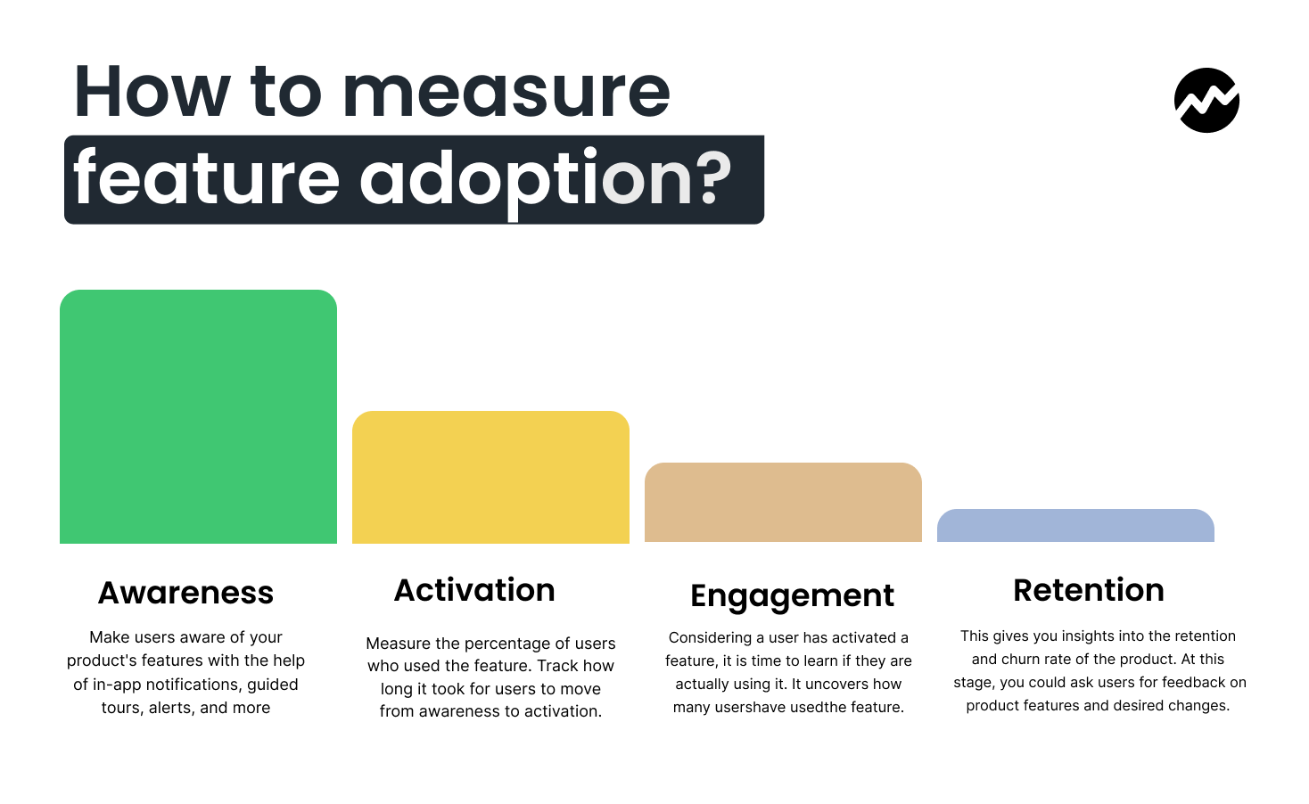
For example, if a user utilises 8 out of 12 available features, the Feature Adoption Depth would be (8 / 12) * 100 = 66.67%. By tracking this metric, banks can prioritise feature development based on customer preferences and enhance user experiences.
Did you know? Feature adoption can vary widely depending on user demographics and the types of features offered. For example, younger users may be more likely to adopt mobile payments or peer-to-peer transfer features, while older users might prioritise check deposit or budgeting tools.
What to do when it’s low: Audit adoption by data readiness. Which features rely on merchant identity, categories, location, subscriptions? Use our Payment Data in Action feature catalogue as your roadmap for what becomes possible once the feed is trustworthy.
3. Average Time to First Transaction
Formula: (Total time taken by all users to complete their first transaction / Number of users)
What it tells you: How quickly onboarding turns into real usage.
This KPI measures how quickly users complete their first transaction after downloading and onboarding to the app. A shorter Average Time to First Transaction (ATFT) is a sign of efficient onboarding, suggesting that the app's user interface and navigation are intuitive and seamless. A long ATFT, on the other hand, could indicate friction points in the user journey or a complicated onboarding process.
For instance, if three users take 2, 5, and 3 minutes to complete their first transaction, the Average Time to First Transaction would be (2 + 5 + 3) / 3 = 3.33 minutes. A lower average time suggests that customers can quickly grasp how to use the app for their primary task - completing a transaction.
What to do when it’s high: Ensure first-transaction details render cleanly (name, logo, category, location where valid). Reduce misunderstandings by identifying payment gateways and normalising merchant presentation where possible.
4. Monthly Active Users (MAUs)
Formula: (Number of unique users who open the app at least once in a 30-day period / Total number of users) * 100
What it tells you: Whether the app remains relevant after onboarding.
Monthly Active Users (MAUs) provide a clear picture of user engagement over a 30-day period. This metric is crucial for banks to track whether their digital banking app continues to provide value to users over time. If a significant percentage of registered users do not return to the app regularly, it may suggest that the app isn’t meeting their needs or that they’re turning to competitors.
For instance, if a bank has 5,000 unique users and 3,500 open the app at least once in a month, the MAU would be (3,500 / 5,000) * 100 = 70%. MAUs are a leading indicator of customer loyalty and app relevance.
Did you know? Banks should aim to increase their MAUs by consistently improving the app’s usability, adding value through new features, and promoting app usage with targeted campaigns.
What to do when it’s low: Treat the feed like your home screen product. Add “feed utility” instrumentation: search usage, merchant detail opens, category edits, subscription views. Use the patterns in our Payment Data in Action report as your benchmark set.
5. Abandonment Rate
Formula: ((Number of users who abandon a process / Total number of users who start the process) * 100)
What it tells you: Where users hit friction, doubt, or drop-off.
Abandon Rate provides insights into customer behavior during transactions or processes within the app. A high abandonment rate indicates friction in the user journey - whether it’s related to app performance, complexity, or a lack of trust. For example, if 100 users start a transaction process but only 80 complete it, the abandonment rate would be (20 / 100) * 100 = 20%.
Did you know? To reduce abandonment rates, banks should conduct usability testing and continuously gather user feedback. Identifying and fixing common pain points will improve the completion rates and enhance the overall user experience.
What to do when it’s high: Segment abandonment by transaction clarity. Identify flows where enriched elements (logo, clean name, merchant URL/contact, recurring labels) reduce uncertainty.
6. Net Promoter Score (NPS)
Formula: (Percentage of Promoters - Percentage of Detractors)
What it tells you: Overall loyalty and word-of-mouth potential.
The Net Promoter Score (NPS) measures customer satisfaction and loyalty by asking users whether they would recommend the app to others. NPS is a highly effective way to assess overall sentiment and predict future growth. If 60% of users are Promoters (satisfied customers who would recommend the app), and 20% are Detractors (dissatisfied users), the NPS would be 60 - 20 = 40.
A positive NPS is an indicator of strong customer loyalty and satisfaction, which are critical for long-term success in the competitive digital banking market.
What to do when it’s low: Add NPS follow-up tagging tied to transaction clarity issues (recognition, merchant mismatch, missing details). Cross-reference NPS dips with changes in enrichment coverage/accuracy, especially for high-volume merchants.
7. Retention Rate
Formula: ((Number of unique returning users / Total unique users in a specific period) * 100)
What it tells you: Whether users stick after the novelty wears off.
Retention Rate is one of the most important KPIs for measuring customer loyalty. It tracks how many users return to the app after their first experience. A higher retention rate indicates that users find ongoing value in the app, and it suggests that the app successfully meets their needs over time.
For example, if a bank has 2,500 unique users and 2,000 of them return within a specific period, the Retention Rate would be (2,000 / 2,500) * 100 = 80%.
These seven key performance indicators (KPIs) offer a robust framework for assessing app performance. Consistently tracking and responding to these metrics empowers banks to enhance user experiences, cultivate enduring customer relationships, and thrive in today's digitally savvy environment.
What to do when it’s low: Treat transaction clarity as a retention lever. Tie retention experiments to measurable improvements in coverage/accuracy/richness.
How Tapix can help
Tapix improves the transaction layer that quietly decides whether your KPIs rise or stall. It takes raw payment data and turns it into transactions people can recognise and use:
- Clean merchant names and recognisable branding
- Better categorisation beyond blunt MCC groupings
- Accurate location enrichment
- Merchant URLs and contact details to support self-serve clarity
- Subscription and recurring payment labels
- Payment gateway detection to reduce “mystery merchants”
When transactions become clear, product performance follows. Teams typically see higher adoption of PFM, subscription controls, search, insights, loyalty, and sustainability features because the underlying data finally supports them. When transactions become the primary interface, data quality becomes product quality.