Five features decide whether a banking app holds users’ daily attention, and each one fails in a specific way when the transaction record underneath it is not accurate. This article focuses on those failure modes and the fields that prevent them.
Gen Z decides fast whether a banking app is worth keeping open, and the choice comes down to a handful of features that make daily money feel manageable. We covered what this generation expects from a bank in a companion overview on what Generation Z expects from banking. This article takes the five features that expectation turns into, and shows where each one breaks.
The list is not the point
There is a temptation to treat a feature list as a shopping list: see what a competitor shipped, build the same thing. A sharper approach is to spend time in the problem the feature solves, and learn what a rival got right about the user, rather than copying the screen they launched. Copy the answer without understanding the question, and you copy the surface while missing the reason it works.
The four things Gen Z expects from a bank only partly become features. Three translate directly into things you build. The fourth, being an institution that reflects the user's values, is governance and positioning.
Clear transaction history
Gen Z reads their transaction feed the way earlier generations read a bank statement, except they do it constantly and expect every line to make sense at a glance. When a charge is unrecognisable, the reaction is immediate: they either hunt through email to place it, or they raise a dispute. That second reaction is the expensive one for the bank, and a meaningful share of card disputes are not fraud at all, but a customer failing to recognise a legitimate purchase.
So a feed a young user can actually read is the foundation everything else sits on. In practice that means each line carries a real merchant name, a recognisable logo, a useful category and, where relevant, a location they remember visiting.
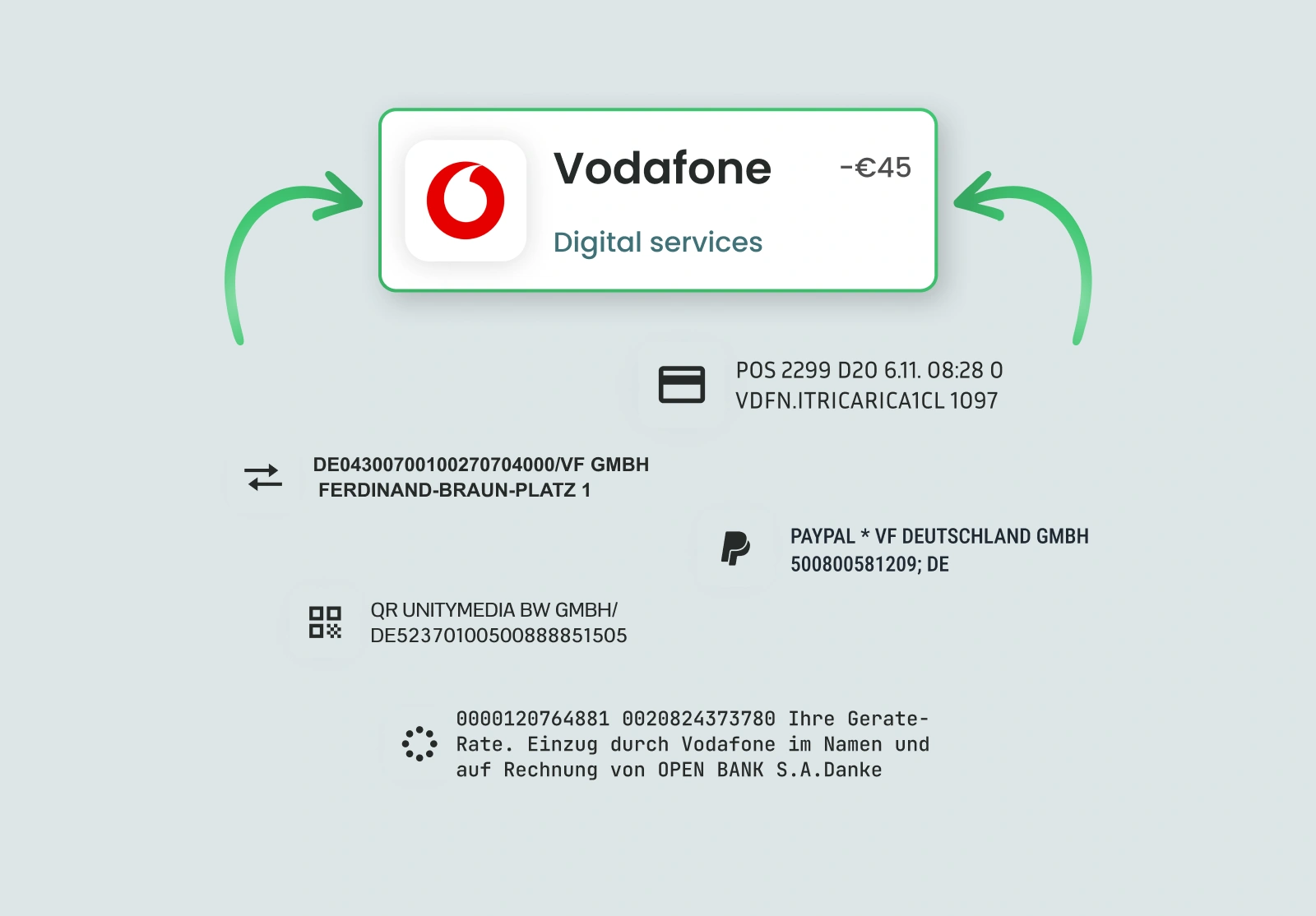
The hardest case is the online purchase that resolves to a payment processor. The user bought something they recognise, but the feed shows a gateway they have never heard of. Identifying the gateway and returning the real merchant behind it turns that line back into something the user placed instantly.
One thing gets overlooked here. Young users scroll back through months of spending to see where their money actually goes, so a feed that only reads well from today forward still feels broken. The back catalogue has to be cleaned too, not just incoming transactions, or the older entries stay unrecognisable exactly where the user is looking.
Subscription management
Gen Z carries more small recurring commitments than any generation before it, and they are painfully aware of how easily those charges slip past. A 2024 survey found 42% of consumers had paid for a subscription they no longer used because they lost track of it. The app that shows those commitments clearly, and lets the user act on them, is the app they trust with the rest of their money.
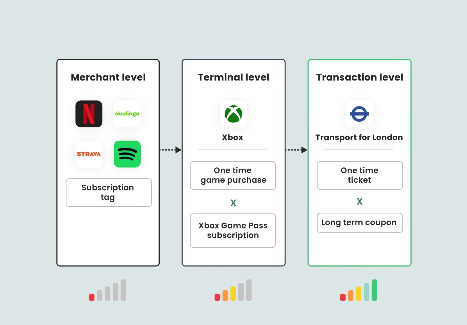
Getting it right depends on one thing: recognising recurrence at the level of the individual transaction, not just the merchant. A user can buy a one-off game and hold a monthly pass at the same store, and an app that only knows the merchant cannot tell the two apart. Recurring Payments Intelligence reads recurrence from the payment behaviour itself, so a commitment shows up as what it is: when it renews, roughly how much, and whether it takes the money automatically.
The case that trips up weaker detection is the free trial that converts to paid. The amount changes when real billing starts, and logic that leans on a fixed sum either misses the switch or misreads it as a brand-new charge. For a young user, that is the exact moment they wanted to be warned about.
There is a business reason to build this properly, it is not just about UX. The moment a subscription is cancelled, a fixed monthly amount is freed up, and that is precisely when a savings or investment nudge lands. The bank that can see the cancellation is the one that can act on it.
Notifications that name the merchant
A payment notification only helps if it settles the question "what was that?" the instant it arrives. Plenty of banks treat speed as the whole point, but a notification that lands two seconds after the tap and shows random description has not answered anything. It has just delivered the confusion faster.
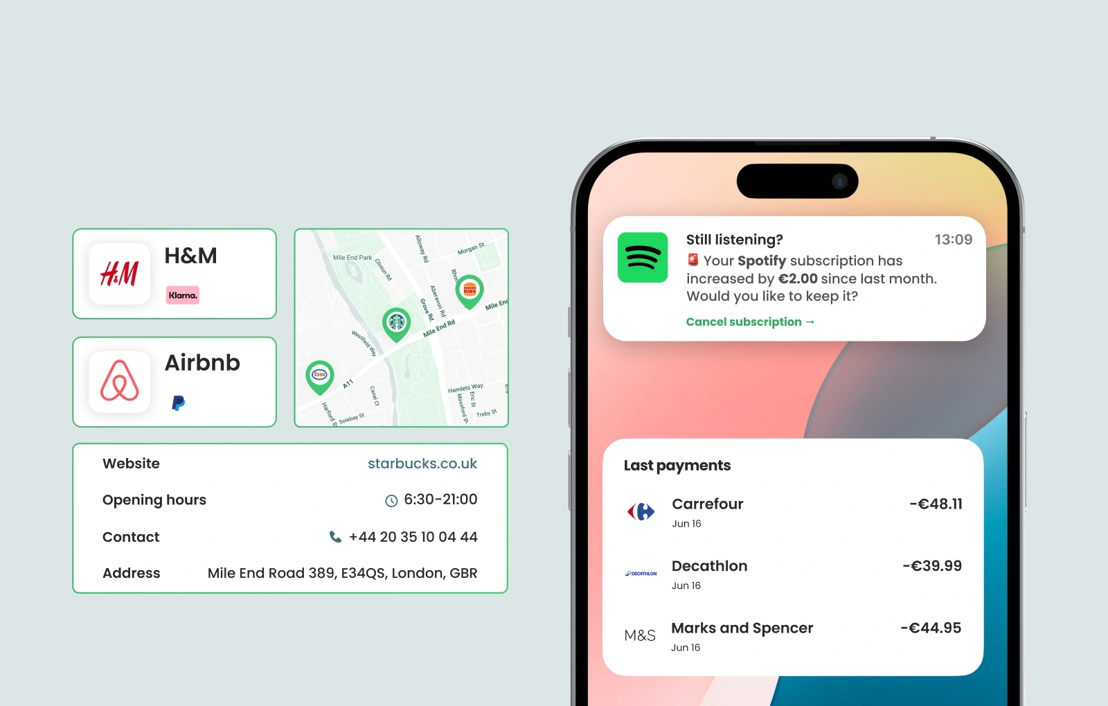
What the alert says is the main point here. "You spent €14.90 at Starbucks" closes the loop on the spot. The same alert carrying a gateway string or an acquirer code forces the user to open the app to find out what happened, which is the exact friction the notification was meant to remove. For a generation that lives in push notifications, an alert that raises a question instead of answering one gets switched off.
Insights and the annual recap
Gen Z wants to understand their spending instead of just seeing it, and they respond to the kind of playful year-in-review recap other apps have trained them to expect. Personal finance management is the everyday version of that; the annual recap is its once-a-year celebration. Both stand or fall on how deep the spending categories go.
Insights mostly fail when the categories are too shallow to act on. Telling a user they spent a certain amount on "general retail" gives them nothing they can change. Depth is the difference: instead of dropping a purchase into one broad bucket, four-level categorisation takes it from a top-level category down through finer tags to something specific. Food and Drink becomes a food order, which becomes a named delivery habit the user can actually see and decide to cut back on.
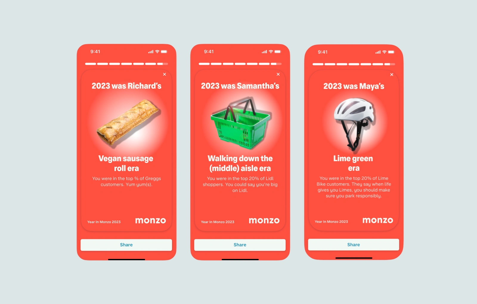
The recap has its own failure reason. It is a single glossy summary of twelve months, and one wrong or blank merchant across that span makes the whole thing look untrustworthy. Spot one obviously wrong line and the user quietly stops believing the rest of the numbers. The recap is only as credible as its worst entry, which makes it a direct test of how well spending was cleaned across the entire year.
Carbon insight per transaction
The overview makes the case for why sustainability signals matter to the user. The naive approach applies one emissions coefficient per merchant category, which produces numbers a user can disprove from experience. Kateřina Linhartová, who built Eco Track at Tapix, makes the point with two examples. Restaurants need price banding, because a cheap meal and an expensive one in the same category do not differ by three times in emissions the way a flat per-euro coefficient implies. Fuel needs pump-level pricing, because the price paid signals a volume that a category average erases.
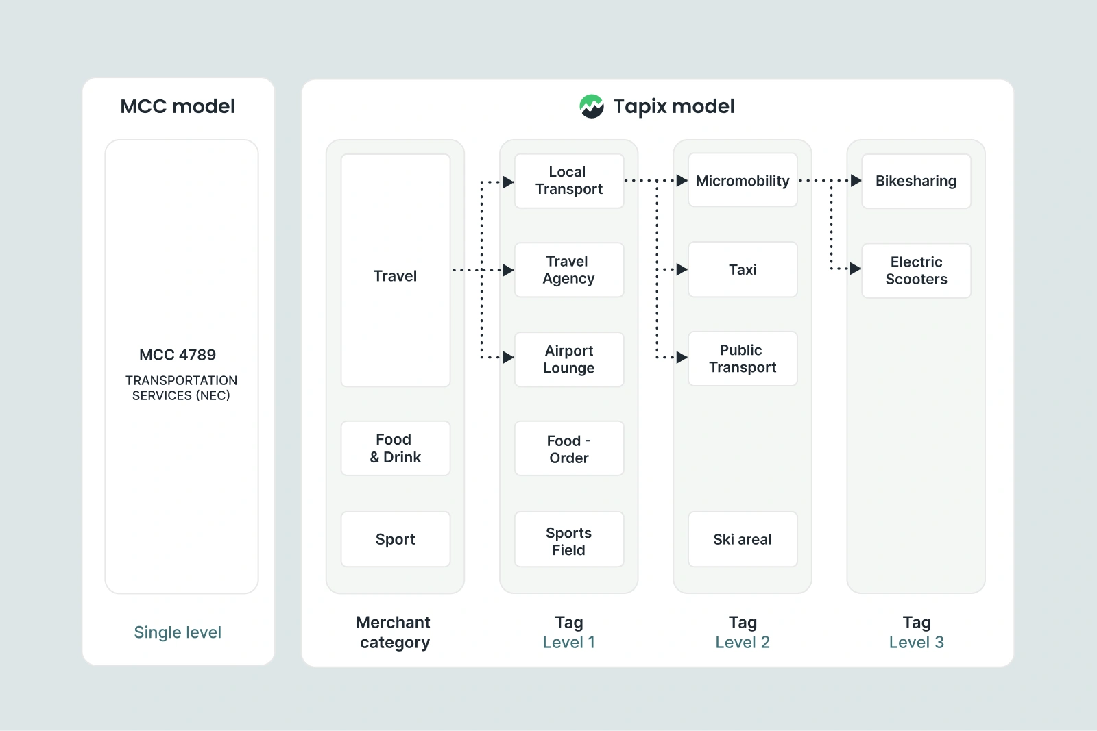
The failure here is category-level coefficients producing figures the user knows are wrong. Show someone a €6 lunch and a €60 dinner as proportional in emissions and they stop believing the feature, because their intuition tells them the relationship is not linear. Trust in a carbon number is fragile, and one implausible figure affects it.
You can test enrichment on your own sample transactions in the developer sandbox.
